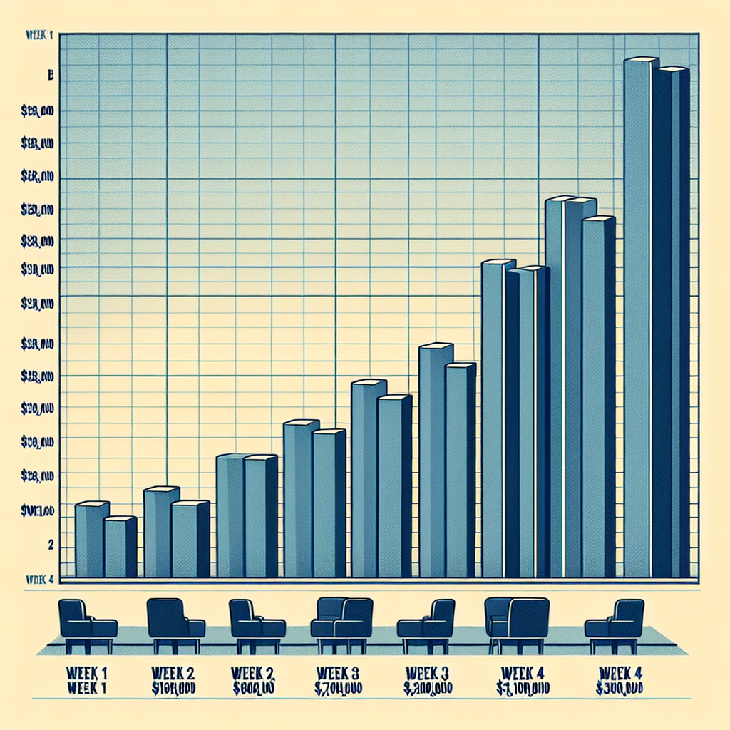
The table shows the amount of money made by a summer blockbuster in each of the first four weeks of its theater release. Which graph could represent the data shown in the table?
A table showing the week and the money made; week 1, $19,600,000, week 2, $7,800,000, week 3, $3,100,000 and week 4, $1,300,000.
Please help
C is the answer.
the numbers are clearly declining. I can't see your graphs, but the curve you want is probably like a slide, sloping down, but concave up.
Which of these can be written as an equation?
A. Two times 0.75 plus m
B. Three is less than twice a
C. Half the product of 5 and j
D. Four times n is 24
To determine which graph could represent the given data, we need to consider the characteristics of the data and the types of graphs that could effectively depict this information.
The given data includes four weeks of theater release, with each corresponding amount of money made during each week. The data is presented in a tabular format, with the weeks and their corresponding monetary values listed.
Since the data represents the amount of money made over time, a suitable graph would be one that shows the relationship between the weeks and the corresponding money made. In this case, a line graph would be appropriate because it allows us to visualize the continuous change in the monetary values over time.
To create a line graph from the given data, follow these steps:
1. On a sheet of graph paper or in a graphing software, create a coordinate system with the x-axis representing the weeks and the y-axis representing the money made. Ensure that the scales on both axes are proportional and appropriately labeled.
2. Plot the data points on the graph by placing a point corresponding to each week and the corresponding amount of money made. For example, for week 1, plot the point (1, 19,600,000) where the x-coordinate is 1 and the y-coordinate is 19,600,000.
3. Repeat this process for the remaining weeks, connecting the points with a straight line to indicate the continuous change in the money made over time.
4. Finally, label the axes with appropriate titles and units (e.g., "Weeks" for the x-axis and "Money Made (in millions)" for the y-axis) and add a title for the graph.
Therefore, the appropriate graph to represent the given data would be a line graph.
ANSWER PLEASE!!!!
please...?
gfiri7or
answers for connexus as of november 2021
B
C
C
C
A
B
B
C
A
D
D
B
A
C
A
the rest you'll have to answer yourself