An image portraying a subtle nod to visualization of data and statistics. The image can depict a stack of wooden or colorful toy blocks, an assortment of different types of candy, and a thermometer with a high temperature reading. The background should be neutral so as not to add any distracting elements. This will serve as an effective representation of the various datasets mentioned: sale of toys in different price ranges, average monthly sales of a big company, varieties of candy sold, and the melting point of hard candy.

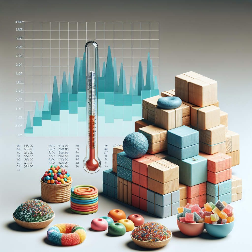
which of the following sets of data would be represented best in a histogram?

A. the number of toys sold in five price ranges.
B. The average monthly sales for the Big Toy company.
C. The number of each type of candy sold last month
D. the temperature at which hard candy melts

In Educational Technology unit4 lesson4

10/2017
1)C
2)A
3)C
4)A

Lionesscave3 is all right

U sure that its correct?? C A C A

First, Lena is your real name Lena

Second, thank you Lionesscave3!

Answers are correct! Thanks, Lionesscave3!

Thank Yall so much! 1. C, 2. A, 3.C, 4.A is correct. I need help with more questions!!! is someone willing to help me?

The anwers arw c a c a

The answer to this is (A

If you go to connexis.com these are the answers
(1. Bar graph
(2. Which is the question the answer is A
(3. C
(4. A
Hope I Could Help! I took this yesterday and made a 100% if you never heard of mrs.sue I'm one of her helpers so dont worry!

(1) C

(2) A
(3) C
(4) A

No, it's A. Just took the quiz and missed that question.